Design File Check List
Press quality PDFs
100% black artwork
Art is either bitmap or vector
1 colour per layer
All type outlined
.5 stroke crop marks
.35 stroke minimum
PMS colours
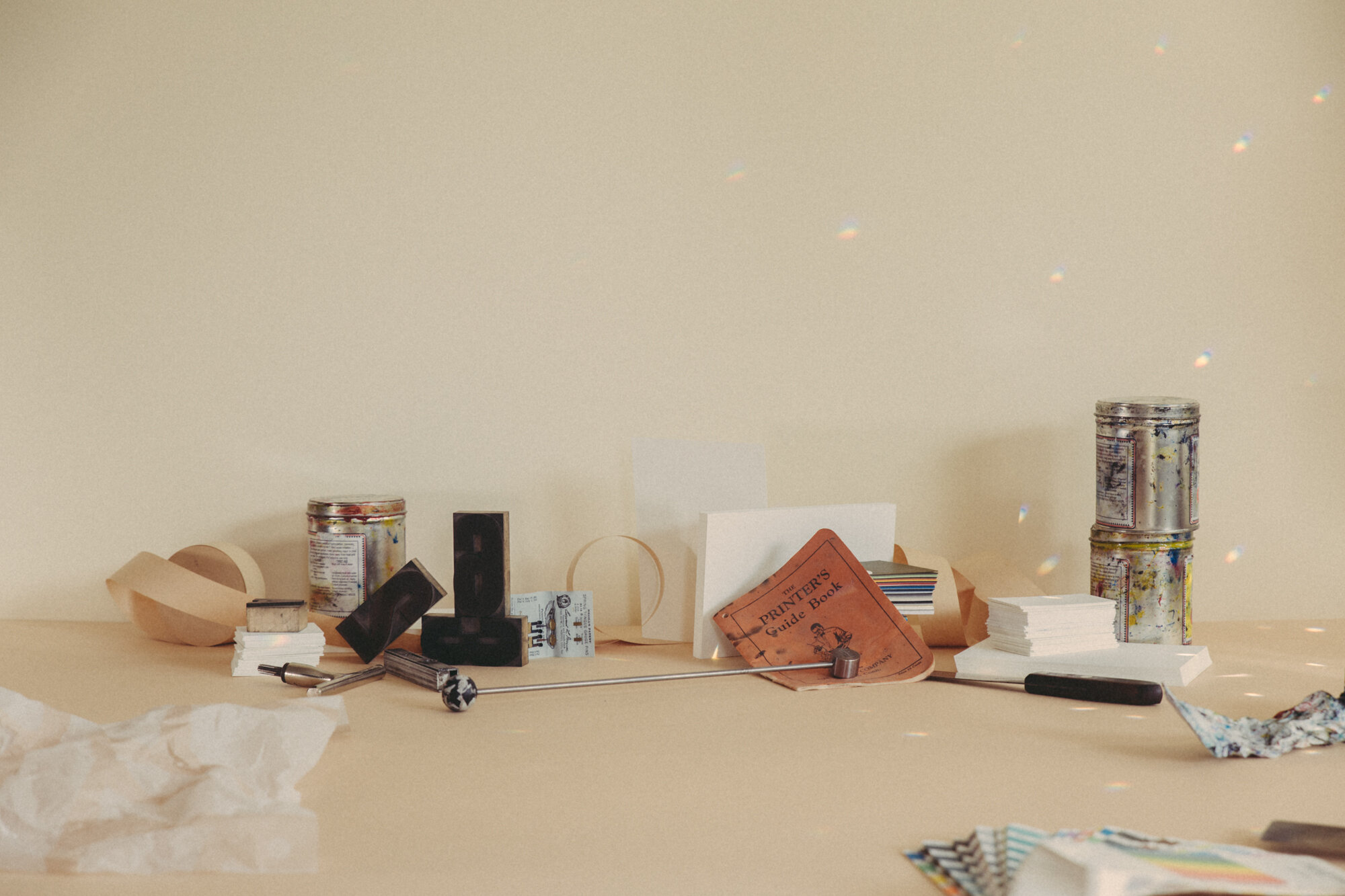
LETTERPRESS FILE PREP GUIDELINES
If you have questions about making your file letterpress friendly please give us a shout. We also offer file prep services, at the rate of $95/hr + GST.
What to send us
We prefer press quality PDFs, ideally created in Illustrator or InDesign, with all type outlined. Illustrator files should have images embedded and editing capabilities turned on.
If your piece is one colour, use 100% Black (K) only in CMYK mode. If your piece is multiple colours, each colour should be separated onto it’s own layer, set in solid Uncoated Pantone swatches. Please include crop marks (set to .5 of a stroke and 100% black) and 0.125” of bleed if there is any.
MORE HELPFUL TIPS
Images
NON-VECTOR | Making letterpress plates requires binary artwork, ie. black and white. If you’re working from hand drawn illustrations or typography, scan it in at 1200dpi to preserve as much detail as possible. In Photoshop, after making any desired adjustments, convert the image to Bitmap with Image>Mode>Greyscale, then Image>Mode>Bitmap, selecting 50% threshold and an output resolution of at least 1200dpi.
VECTOR | Perfect for letterpress, vector images from Illustrator or InDesign should be solid and either 100% Black or your chosen Uncoated Pantone swatch. Make sure all negative space is knocked out using the pathfinder tool.
Type
All type in the file must be outlined. In InDesign or Illustrator head to Type> Create Outlines.
Halftones
Since we cannot print percentages of a colour, halftone images can be a great way of creating the impression of a lighter tone of one colour. If you want to incorporate halftones into your project, please send us your working file or give us a shout so we can make sure the files are letterpress friendly.
Fine Lines
There is a threshold for small details that hold up in the platemaking process. Please keep fine lines to no less than .35 of a stroke. Small dots, when isolated on their own can disappear, so bump up those small dots if need be.
Maximum Print Size
The maximum stock size we can print is 16” x 22”. The maximum polymer plate size is 13” x 19”. (In other words, we can print on paper up to 16” x 22”, with an image as large as 13” x 19”.)
Ink Colours
We hand mix every colour using a Pantone Solid Uncoated swatch book. These colours can be dramatically different from how they look onscreen - if you don’t have access to a Pantone swatch book we can match physical samples (paper, fabric etc.) or you can visit us in the studio to match using ours.
Solid Colour Washes
Letterpress inks are not opaque and so are not the ideal printing method for achieving large solid blocks of colour. Especially on toothy cotton stocks like Crane Lettra, the texture of the paper shows through the transparency of letterpress inks, which gives you patchy colour washes. We think the ‘salty’ texture of solid floods are beautiful and have a distinct vibe all on their own - another reason that letterpress printing is so unique.
Impression
The amount of impression (“deboss”) we can achieve depends on a number of factors. A thick, soft stock with high cotton content will produce the most pillowy impression. The density of the design will dictate the impression as well. Large continuous areas of design and plate will result in a more shallow impression. A plate with a large surface area like a halftone or solid flood of colour will not ‘bite’ into the paper like fine type will.
Extra consideration must be taken with double sided designs if you are looking for a deep impression, as the impression of one side will need to be managed in order to not interfere with the impression on the other.
If you have a preference for a deep vs. kiss impression in your piece, please give us a heads up when you submit your files and we can factor that in as best as possible.
Blind deboss, ie. no ink, is a beautiful thing. However, keep in mind that legibility of small type with no ink can be a challenge.